CHROMA Plex Design System
Chroma is Plex's ultimate design system, after three major iterations.
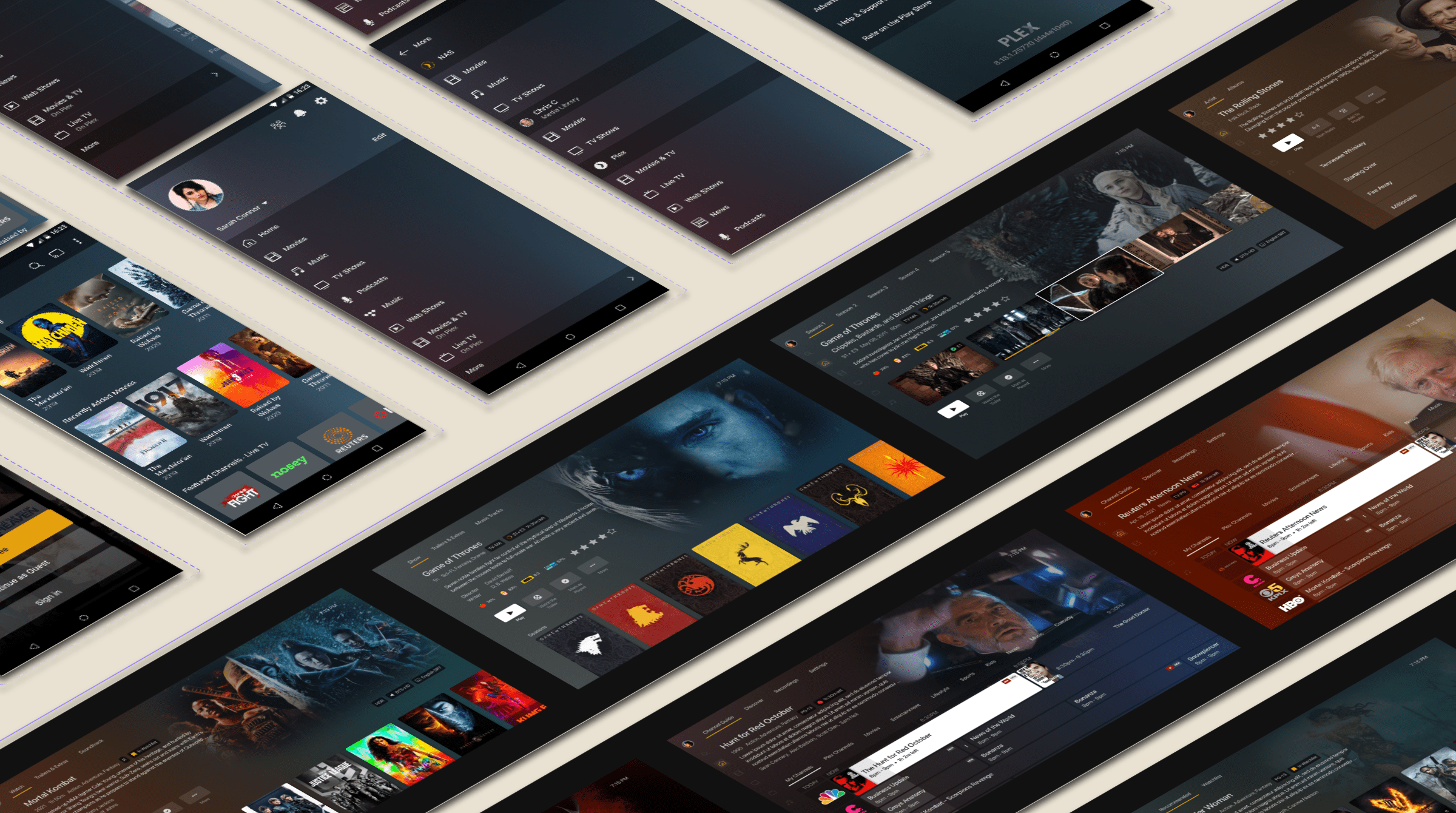
A Multiplatform system
Another crucial part of my work at Plex was the creation of Chroma, Plex’s design system, built by unifying previous design systems and UI kits with our design principles and reusable components.
We unified icons, colors, spacing, typefaces, and interaction patterns for all platforms and devices, defining the specifics of platform interactions and animation principles.
Chroma's goal was to provide a consistent visual language regardless of the device while having in mind the different platform nuances, like screen sizes, input types, and user context.
For everyone
We wanted to have a holistic design system made by and for everyone.
Working closely with the Marketing team, Plex brand requirements were seamlessly integrated into Chroma. This allowed all materials generated through the design system to be used in communication pieces.
Our continuous collaboration with the Development team led us to create Figma plugins using the same code as the production team to generate visual assets.
Chroma helped ensure that the designs created during the design phase were accurately translated into the final production phase.
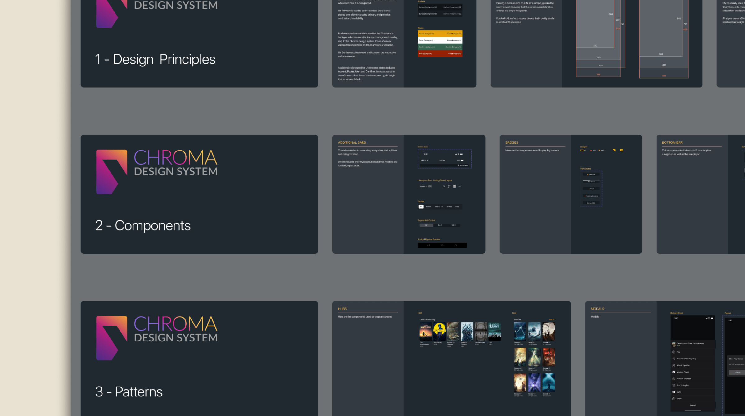
3 Pillars Structure
The system was built with these 3 pillars structure:
1.- Design Principles
These are the design system's foundations, which defines the use of colors, icons, sizes, grids, and other elements to guarantee a consistent experience across multiple platforms.
2.- Components
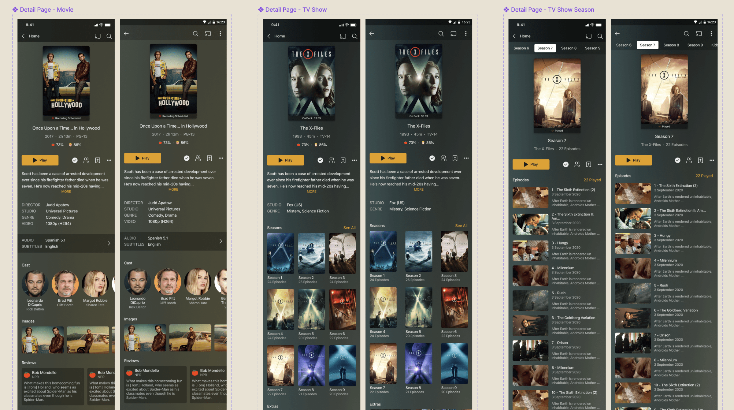
These are the platform's specifics. A layer built using the platform requirements with Plex's own UX patterns to deliver a platform-based experience while maintaining the brand essence.
3.- Patterns
These are the structural components of the app. Elements like swimlanes, HUBs, artwork containers, lists, menus, etc.
-
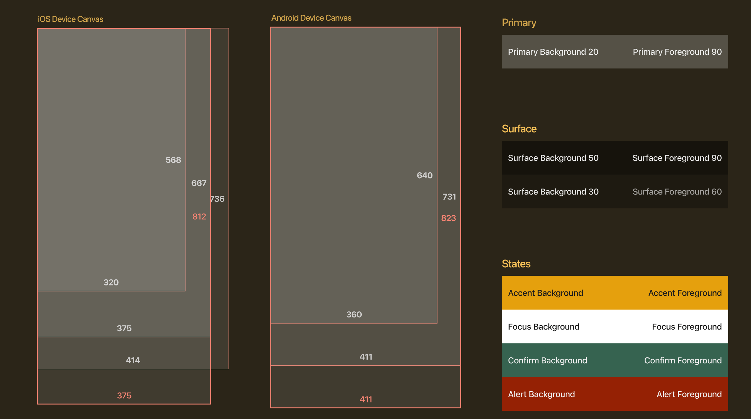
Canvas sizes and colors - Mobile -
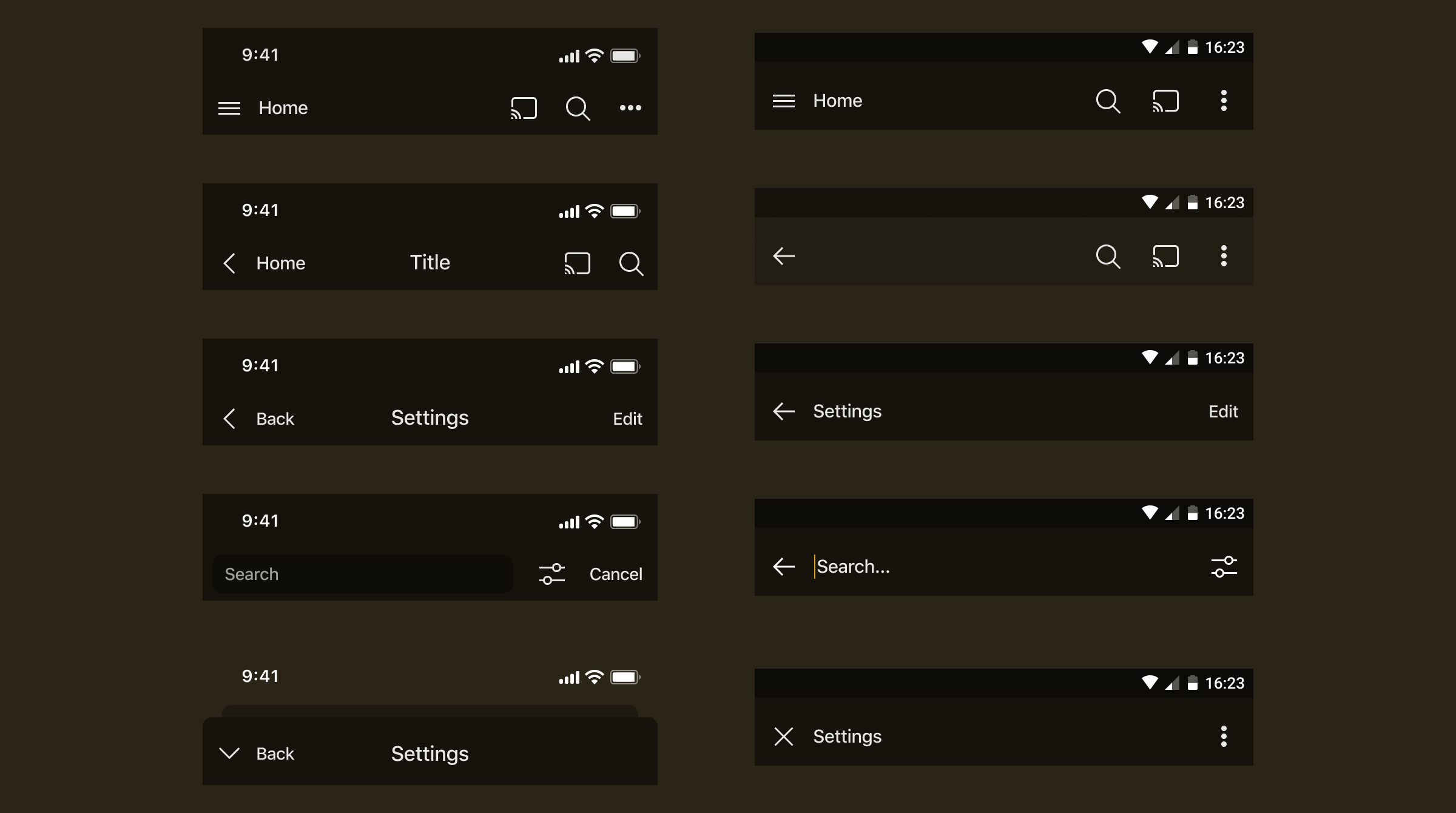
Android and iOS Navigation bars - Mobile -
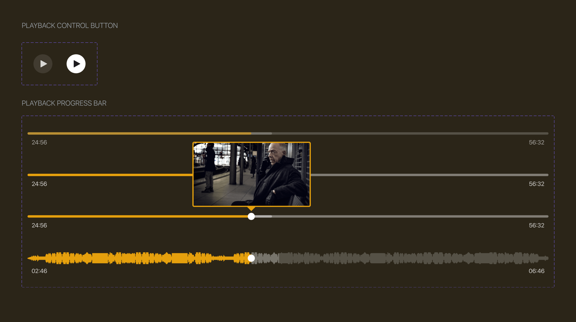
Buttons and progress bars variants - TV -
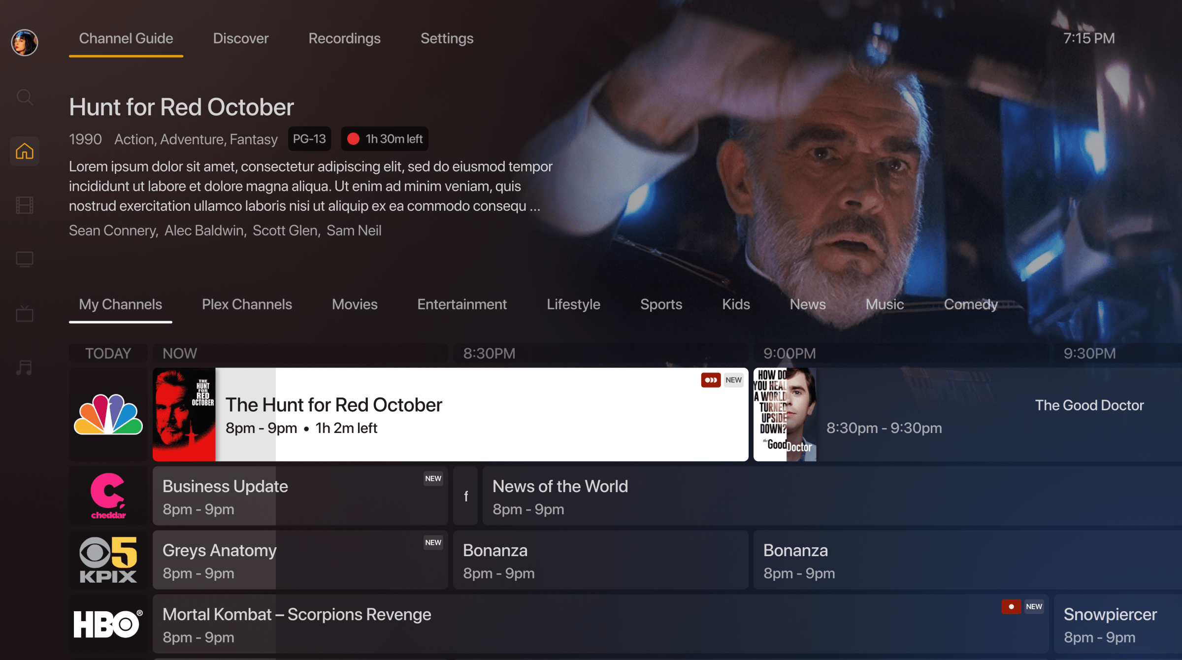
Channel guide view - TV -
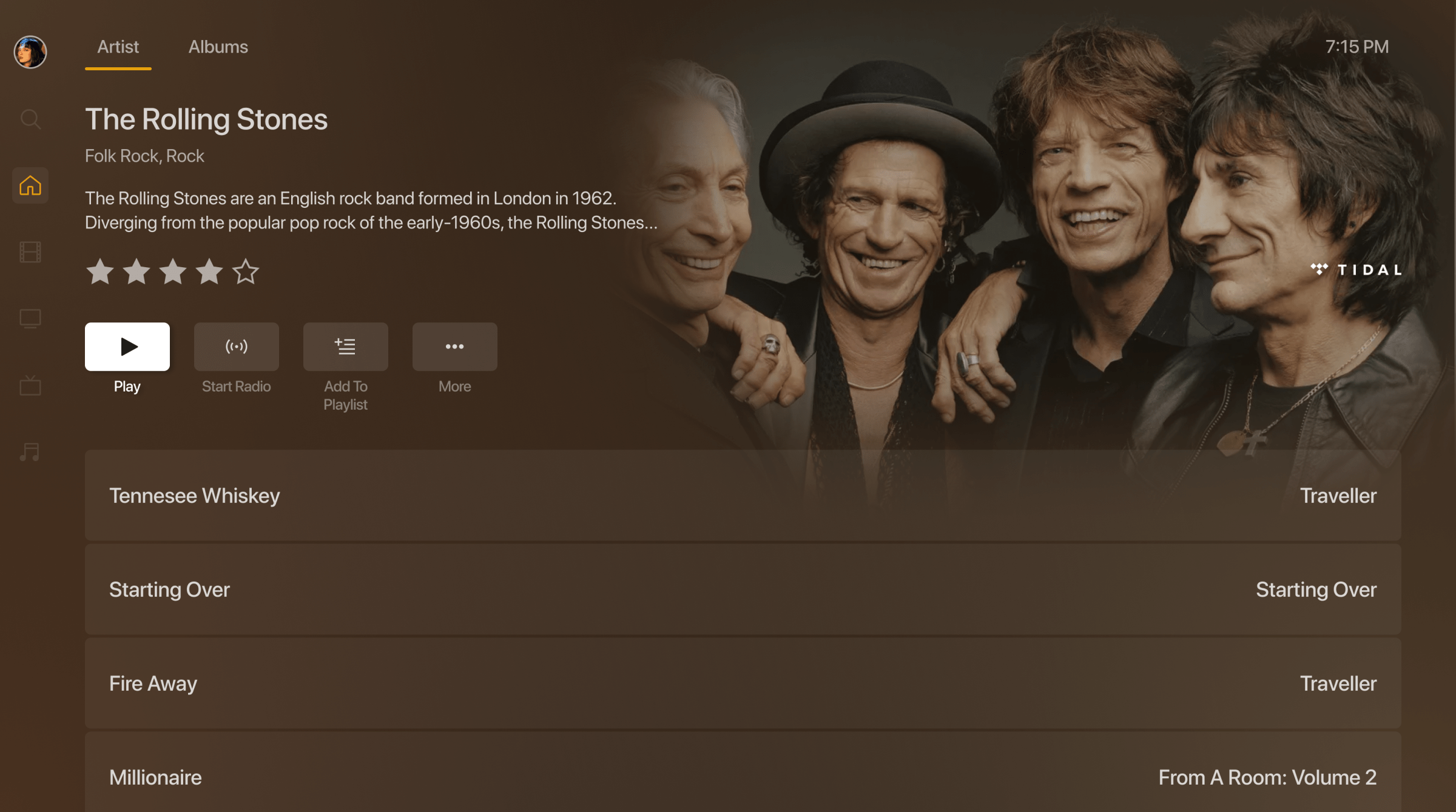
Music Artist view - TV